
Harmony
Harmony is a new master-planned community in Aurora, Colorado. They cut through the clutter of builder subdivisions by bringing a brand new home experience to the area, which includes a surprisingly high majority percentage of millennial homebuyers. We embraced the challenge that inevitably came with the name ‘Harmony’—how to make this Harmony unforgettable
Services
Brand campaign, event coordinating, logo, print collateral, promotional campaign, social media, website
Client
Harmony, Melcor Development
Location
Aurora, Colorado

Grand Opening Experience
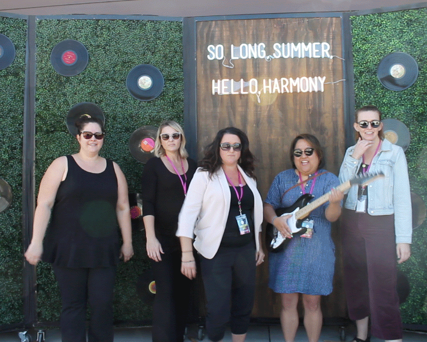
So long summer, hello Harmony! We made a huge splash in the Aurora marketplace with the grand opening of Harmony. The wild, vivid color palette and "harmonious" theme was seen throughout the community with the neverending balloon garland, rockin’ record photo booth, and crave-worthy cookies.
We expected only 200 event attendees but ended up with more than 240 from 185 webpage sign ups! All were impressed with the thought and care that was put into the community.


Online
Quick quips, words of wisdom, and tantalizing trends. The aspirational yet attainable brand is integrated throughout all online applications, from the pop culture references to bold quote cards in social media to the sleek design and easy user experience on the website. HereInHarmony.com grounds our message in the place that is Harmony, while our duo of hashtags, #AtHomeInHarmony and #GimmeHarmony, appeal to a wide audience. “In Harmony” dovetails location with musicality, while pairing the bold gimme with the Zen and serene harmony creates an unforgettable call to action. No other “Harmony” community would dare to be this audacious, but here in Harmony Colorado, the balance is perfect, and the sentiment is heartfelt.


Community brochure + tour guide
2021 Nationals Winner Silver Award for Best Brochure for a Master-Planned Community!
Embracing the harmony within Harmony, we’re playing (so to speak) with optimistic musical language that also has deeper emotional ties. These lines are timeless and ageless, showing how you’ll find your groove in home designs that excite you, in hiking trails just beyond your backyard. Lines like Strike a chord and Totally jazzed speak to the precious connections that are made here, while Bring it on home bridges this theme to the product, showing where this (very big) band lives. Our tagline, Start on a high note, speaks to the beginning of a new story in Aurora, as well as the very first new home for so many in our demographic. (BONUS: High note also implies that buyers will discover many personal bests in Harmony—home to their favorite people, lifelong passions, and proudest achievements.)


Outdoor
We made an unapologetically bold move in the Denver area with more than 50 outdoor placements in both city and suburban neighborhood bus shelters to start building the excitement for Harmony’s opening!


Logo
To balance out the rockin' brand vibes, Harmony's uniquely dynamic logo encompasses the prairie architecture that inspired the design of the community's amenity center, The Venue. Strong, diagonal lines mimic the butterfly roof of The Venue and weave their way throughout the brand, emphasizing connections and giving consumers’ eyes a path to follow. The logo's icon is an ambigram—reading the same upside down as it does right side up—so it’s perfectly suited for the implied rotation action of the brochure's 45 rpm record design.


